
Wednesday, 27 April 2011
Cinematic Shoot
For the cinematic photoshoot I hired clothing from Hepwright's vintage shop to stay true to the 1950's. I wanted the styling to be very precise, elegant and to represent the wealth of a 'Lady of Leisure.' The concept of the shoot was to have the model leisurely acting like a male and doing activities that men reguarly do. This included being at the pub, a takeaway, smoking and with her dog (one man and his dog). Ideally the shoot didn't go as well as I had hoped and only ended up with four suitable images. Although the images I did manage to get were quite strong and once edited really captured the 1950's and the concept I hoped for. However due the the amount of other images from the two other shoots I feel this may be pushed aside a little bit. So emphasis will be taken on the cinematic trend in particular to ensure it reaches the standard of the newspaper.


Illustrations
After deciding that The Style Observer would include a range of illustrations relevant to each trend I have struggled to find something that is suitable. I've asked a range of different illustrators, a couple of which have produced some art work but none has been what I wanted. I originally wanted the illustrations to be of a range of accesories that fit within the trends. It has since been decided that the illustrations will be focused around the textures and colour pallet of the trends. Rather than using pantone colour charts they will be represented through garments within the illustrations.
Sunday, 24 April 2011

Monday, 18 April 2011
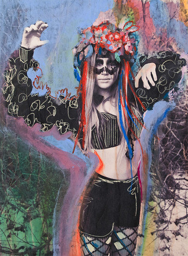
Primal Futurism Shoot
On Saturday the Primal Futurism took place at Rest Bay Porthcawl, just 30 minutes away from central cardiff. It's a long stretch of beach that has a collection of rock pools and a large rock area that I knew would be ideal for the chosen location. It was a beautiful sunny morning and me and the photographer made our way down at 6.30am. On the way we picked up Signe - Model and Katie - Make up artist. In total we shot for different looks, consisting of a lot of fur, dulled metallics, and high shine silvers. We also featured 3 different make up looks to compliment the outfits, with a lot of bronzes, silvers and golds. The final make up look was decided to be used as a beauty shot to bring together the collection of images. I also used alot of leather and optical style sunglasses. To ensure the look stayed looking expensive I used three different pairs of tailored trousers which help maintain the high fashion side of the style (all second hand).
When deciding on the direction for The Style Observer I knew I wanted the clothing that was used in shoots to be only second hand, vintage and DIY. I wanted the inspiration from the trends to be something used to inspire, through shapes, colours and textures.
Overall the shoot ran very smoothly, we shot 5 different looks over the space of 5 hours which I feel is very productive. As the sun got brighter throughout the day we struggled to find a suitable area to shoot as the sun was effecting the model and her ability to pose.


Monday, 4 April 2011
Friday, 1 April 2011
FRONT COVER

Monday, 21 March 2011

Faux Real Lighting Inspiration


After looking for the right image to sum up the lighting technique I hoped for I came across these images. As the clothing I'm using is going to be quite bright I wanted to tone the looks down through the lighting but to ensure the colours were still prominent. The two images below give a rough idea of what I would want, almost as if the images are over exposed but still very clear.
Saturday, 19 March 2011


Friday, 18 March 2011

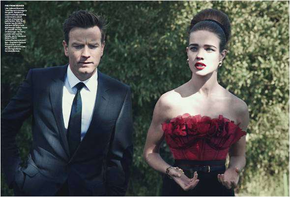
Lady of Leisure - Marie Claire Turkey
One of my favourite shoots that I came across was an editorial from Marie Claire Turkey. They really managed to capture the richness within the glamorous side of the 50's housewife. The whole shoot was extremely elegant.


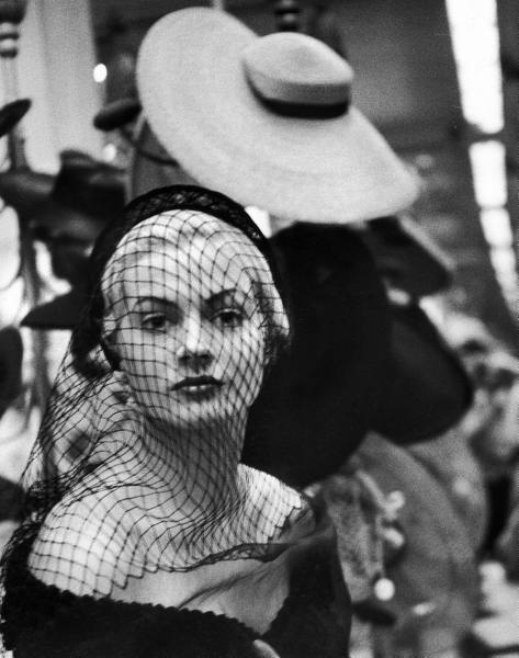
Cinematic Editorial Inspiration
Had a look at editorials with a 1950's glamour concept to gather some ideas for my Cinematic shoot. Came across alot of Jewel and Jewel colours and pristene hair.


La Dolce Vita - Federico Fellini
The movie La Dolce Vita has been the primary basis of my inspiration for the Cinematic trend. Anita Ekberg is amazingly glamorous throughout the film. Her collection of evening and cocktail dresses do not fail to amaze. Herself and Anouk Aimee both are iconic stars and ooze pure Hollywood glamour.


Flame Haired Warrior: Vogue Nippon
Lovely inspiration for my Primal Futurism shoot. A nice idea - made me think of fur throws to use as cardigans and giant fur trimmed coats. Lots of leather trim and fire red hair. Lovely, lovely, lovely!

Faux Real Wardrobe Ideas

Todd Lynn’s primal instincts: Autumn / Fall 2010
Struggling to find a way to connect the Primitive side of the trend with the much more futuristic side without it looking crazy and mismatched. After searching through designer collections and runway shows I came across the designer Todd Lynn. For Autumn 2010 at London Fashion Week he produced a collection that infused futuristic toned leather with animal fur. The clever tailoring and modern cuts really gave it a unique space style, but the fur added a 'Planet of the Apes' twist.


Hepwright's
Popped into Hepwright's today after a discussion with Catherine, to have a scout around at the dresses for the 'Cinematic' shoot. I thought Hepwright's would be ideal and I was right. Some really amazing pieces in there. Hopefully going to borrow a few from the collection as theres no better way to achieve the vintage look than by using the real thing.


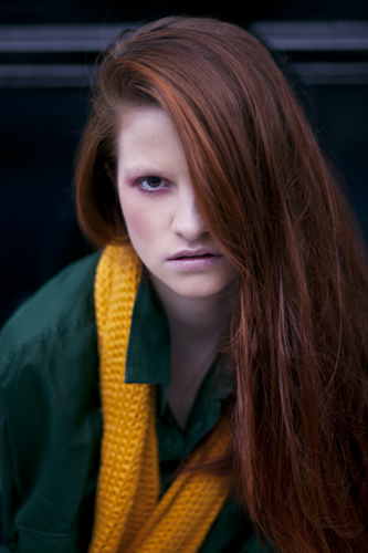
Emily Karlsson Interview Answers
Hi there!
No problem at all. Sure you can use my photos. I wouldn't mind.. Just take the ones you find inspiring or think would fit for the interview :) I actually think it would be better if you choose the photos!
Please, tell me if there is any question I took wrong or something, haha.
This was a fun interview btw! Thanks for doing it. Would be lovely if you could tell me when it's up!
Here's the answers anyway:
1. I love to look through magazines. Dansk, Zoo magazine an Love are good examples! I'm also very fascinated about the 65-70s fashion and the early 90s.
2. I wouldn't say that I have a favorite store really. But I love vintage and second hand and I think Beyond Retro, Emmaus, Lisa Larsson etc. is nice if your looking for fine vintage clothing. Otherwise I think Weekday can have some lovely things. Topshop unique ss11 is btw fantastique!
3. I've been checking out a pair of red shorts from Topshop unique. They haven't arrived to the store yet thought, but I'm keeping my eyes open! I'm also dreaming of the fantastic shades from Fendi's ss11 and a pair from Cacharel. Maybe some jewelry's from Proenza Shouler..
4. I think the fashion was lovely 2010 and a lot of it seems to come back in 2011. Like the creepers, colored hair, round sunglasses etc. I feel like it's pretty worn out. But I still like it though.
5. As is said before, I love the 70s and 90s. I don't really follow trends if there isn't something I really like. Otherwise I just put on whatever I think looks good and try to match that as good as possible, haha.
6. I think most of my inspiration comes from magazines, music, films etc.
7. Wow, I have no idea really. But I will probably wear the clothes I'm wearing now, haha. When I buy clothes I try to buy as "timeless" pieces as possible. It's always so boring to have clothes from last year that you'll never use again.. so I'm trying to avoid that by thinking forward and not buy things that I only fancy for the moment.
Love,
Emily
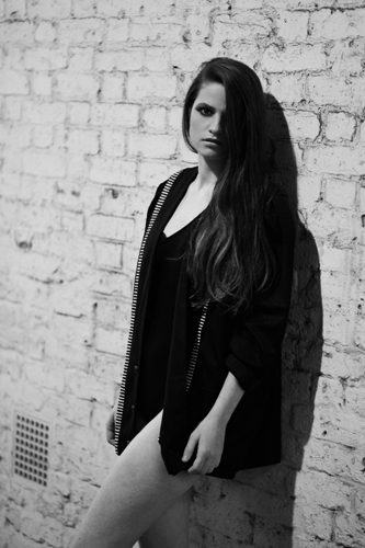
Imme Visser
Recently shot with Gareth and Imme Visser from Bookings models hoping for a front cover image.

Thursday, 17 March 2011
Font
Subscribe to:
Posts (Atom)